The Bango Dashboard
DVM > Dashboard
What is the Bango Dashboard?
The Bango Dashboard provides the ability to view the performance of your partnerships for our Digital Vending Machine product in near real-time.
How do I access the Bango Dashboard?
Contact Bango Support to get started.
Components in the Bango Dashboard
What does the DVM Overview show me
The DVM Overview is brilliant at giving you high-level view on how your partnerships are performing. It does this by looking at the states of your entitlements in a period of time.
What’s the Partner Selector
The Partner Selector allows you to narrow down the DVM Overview on specific partners and view data just related to those partners.
What’s the Status overview
The Status overview is a fantastic tool for seeing at a glance what’s the latest view of your entitlements across your partnerships. By default it show’s you the current state of your entitlements. If you want to historically view the states of your entitlements on a specific day just change your date range and the Status overview will show you the status of your entitlements on the last day of a date range.
Making sense of the data from the status overview
What does the Pending metric show me.
The pending metric shows you how many entitlements are in the state of pending at a specific point in time. The pending state is the state before an entitlement is activated it’s the state given to entitlements that are waiting for the user to complete a required process before service activation (usually registering for the services).
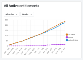
What does the All Active metric show me.
The All Active metric shows you how many entitlements are in either of the Active states at a specific point in time. The two active states are:
Active – This state means the customer has access to the service being provided.
Active-Ending – This state means the customer has access to a service being provided currently, but there is an end date already set for when access to this service will be removed (at that point in time the entitlement will move to Ended).
What does the All ended metric show me.
The All Ended metric shows you how many entitlements are in either of the Ended states at a specific point in time. The two Ended states are:
Canceled – This state means the customer no longer has access to a service. This is usually triggered as a soft-cancel and part of the expected lifecycle to an entitlement.
Revoked – This state also means the customer no longer has access to a service. This is usually triggered as a hard-cancel and is immediately actioned such as the customer has closed their account.
What’s the Status Graph
The Status Graph is excellent for seeing the general trends of your entitlements. You can look at large data periods, see insightful trends and spikes in activity. Allowing you to correlate trends with knowledge of your own campaigns.
What’s the New Activations Graph
The New Activations Graph is exceptionally useful for seeing the trends of activations. Unlike the other metrics that show you what’s the state of your entitlements on a specific date, this graph shows you all the times entitlements have been activated. It’s split by product so you can compare product performance against each other over a selected time period.